I awoke this morning to my daily routine $-$ check Slashdot; check Google news; open the Chicago Tribune app. In the Trib there was much ado about politics, interesting as usual, but the story that caught my eye was "Study: Illinois traffic deaths continue to climb," by Mary Wisniewski (warning: link may be dead or paywalled). The article's "lead" provides a good summary: "A study of traffic fatalities nationwide by the National Safety Council, an Itasca-based safety advocacy group, found that deaths in Illinois went up 4 percent in the first half of 2017, to 516 from 494, compared to the first six months of last year. The national rate dropped 1 percent for the same period." Now, before you read the rest of this blog, ask yourself: Does the data presented in this quote imply that drivers in Illinois are becoming more reckless, while the rest of the nation is calming down?
There's another way to phrase this question: Is the 4% increase between the two half-years statistically significant? The simple answer is no. However, this does not mean that traffic deaths are not rising; there is good evidence that they are (with an important caveat). But to reach this conclusion, we need to examine more data, and do so more carefully. Unfortunately, a careful examination requires discussing Poissonian statistics, which is admittedly heavy. But with the lay reader in mind, I'll try to keep the math to a minimum.
Poissonian statistics and error bands
Poissonian statistics describe any process where, even though events occur with a known, constant rate \begin{equation}\lambda=\frac{\text{events}}{\text{sec}},\end{equation}you can't predict when the next event will occur because each event happens randomly and independently of all other events. To make this definition clearer, we can examine radioactive decay.
Watch this video of a homemade Geiger counter, which makes a click every time it detects an atom decaying. When the radioactive watch is placed next to the sensor, you should notice two things:
- The clicks seem to follow a constant, average intensity. The average noise from the counter is more-or-less constant because the decay rate $\lambda$ is constant.
- Within the constant noise level are bursts of high activity and low activity. The decays are kind of "bunchy".
It is important to properly interpret #2. A cadre of nuclei do not conspire to decay at the same time, nor do they agree not to decay when there are stretches of inactivity. Each atom decays randomly and independently; the "bunchiness" is a random effect. Every so often, a few atoms just happen to decay at nearly the same time, whereas in other stretches there are simply no decays.
We can make more sense of this by pretending there's a little martian living inside each atom. Each martian is constantly rolling a pair of dice, and when they roll snake eyes (two 1s) they get ejected from the atom (it decays). Snake eyes is not very probable (1 in 36), but some martians will get it on their first roll, and others will roll the dice 100 times and still no snake eyes. And if we zoom out to look at many atoms and many martians, we'll occasionally find several martians getting snake eyes at nearly the same time, whereas other times there will be long stretches with no "winners".
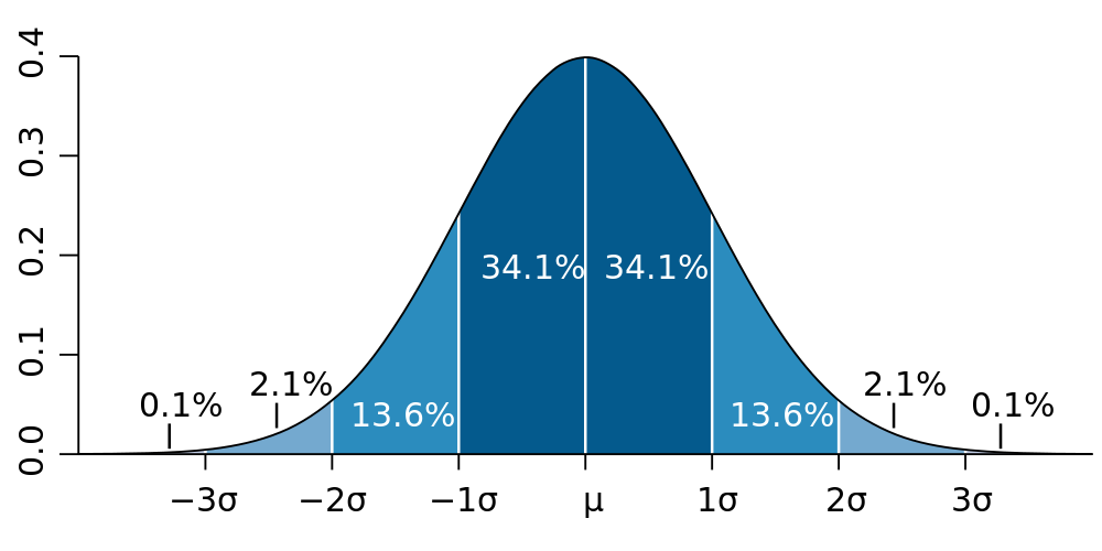
The "bell curve" (normal distribution). The height of the curve denotes "how many" things are observed with the value on the $x$-axis. Most are near the mean $\mu$.
Returning to reality, imagine using the Geiger counter to count how many atoms decay in some set time period $\Delta t = 10\,\text{s}$. If we know the average rate $\lambda$ that the radioactive material decays, we should find that the average number of nuclear decays during the measurement period is\begin{equation}\mu=\lambda\,\Delta t\end{equation}(where we use the greek version of "m" because $\mu$ is the mean). But the decays don't tick off like a metronome, there's the random bunchiness. So if we actually do such an experiment, the number $N$ of decays actually observed during $\Delta t$ will probably be smaller or larger than our prediction $\mu$. Our accurate prediction (denoted by angle brackets) needs a band of uncertainty \begin{equation}\langle N \rangle = \mu \pm \sigma,\end{equation}where $\sigma$ is the error. Numbers quoted using $\pm$ should generally be interpreted to indicate that 68% of the time, the observation $N$ will fall within 1 $\sigma$ of the predicted mean. While this requires 32% of experiments to find $N$ outside $\mu\pm\sigma$, 99.7% of them will find $N$ within $\mu\pm3\sigma$. These exact numbers (68% within 1 $\sigma$, 99.7% within 3 $\sigma$) are due to the shape of the bell curve, which shows up everywhere in nature and statistics.
Poisson found that for Poissonian processes (constant rate $\lambda$, but with each event occurring at a random time), the number of events observed in a given time exactly follows a bell curve (provided $\mu$ is larger than about 10). This allows us to treat Poisson processes with the same kind of error bands as the bell curve, with the predicted number of events being\begin{equation}\langle N\rangle = \mu \pm \sqrt{\mu}\qquad(\text{for a Poisson process, where }\mu=\lambda\,\Delta t\text{)}.\label{Ex(Poiss)}\end{equation}This equation is the important result we need, because Eq. \eqref{Ex(Poiss)} tells us the amount of variation we expect to see when we count events from a Poissonian process. An important property of Eq. \eqref{Ex(Poiss)} is that the relative size of the error band goes like $1/\sqrt{\mu}$, so if $\mu=100$ we expect observations to fluctuate by 10%, but if $\mu=10,000$ the statistical fluctuations should only be about 1%.
Traffic fatalities are a Poissonian process
It is difficult to use statistics to dissect a subject as grim as death without sounding cold or glib, but I will do my best. Traffic accidents are, by definition, not intended. But there is usually some proximate cause. Perhaps someone was drunk or inattentive, maybe something on the car broke; sometimes there is heavy fog or black ice. Yet most traffic accidents are not fatal. Thus, we can view a traffic death as resulting from a number of factors which happen to align. If one factor had been missing, perhaps there would have been a serious injury, but not a death. Or perhaps there would have been no accident at all. Hence, we can begin to see how traffic deaths are like rolling eight dice (one die for each contributing factor, where rolling 1 is bad news). While rolling all 1s is blessedly improbable, it is not impossible. Of course some people are more careful than others, so we do not all have the same dice. But when you average over all drivers over many months, you get a more or less random process. We don't know when the next fatal accident will occur, or to whom, but we know that it will happen. Hence we should use Poissonian statistics.
We can now return to the numbers that began this discussion; in Illinois, 516 traffic deaths occurred in the first half of 2017 and 494 in the first half of 2016. If these numbers result from a Poissonian process, we could run the experiment again and expect to get similar, but slightly different numbers. Of course we can't run the experiment again. Instead, we can use Eq. \eqref{Ex(Poiss)} to guess some other numbers we could have gotten. Assuming that the observation $N$ is very close to the mean, we can put an error band of $\sqrt{N}$ around it. This assumption of proximity to the mean is not correct, but it's probably not that bad either, and it's the easiest way to try to estimate the statistical error of the observation.
Presenting the same numbers with errors bands, $516\pm23$ and $494\pm22$, we can see that two numbers are about one error band apart. In fact, $516=494+22$. Using the fact that relative errors add in quadrature for a quotient (if that makes no sense, disregard it), the relative increase in Illinois traffic deaths from 2016 to 2017 was $4.4\%\pm 6.3\%$. So it is actually quite probable that the increase is simply a result of a random down-fluctuation in 2016 and a random up-fluctuation in 2017. This immediately leads us to an important conclusion:
Statistics should always be quoted with error bands so that readers do not falsely conclude they are meaningful.
On the other hand, just because the increase was not statistically significant does not mean it wasn't real. It just means we cannot draw a lot of conclusions from these two, isolated data points. We need more data.
Examining national traffic deaths
The National Safety Council (NSC) report quoted by the Chicago Tribune article can be found here (if the link is still active). I have uploaded the crucial supplementary material, which contains an important third data point for Illinois $-$ there were 442 deaths in the first half of 2015. This tells us that the number of deaths in 2017 increased by $17\%\pm6\%$ versus 2015. Since this apparent increase in the underlying fatality rate is three times larger than the error, there is only a 3 in 1000 chance that it was a statistical fluke. The upward trend in traffic deaths in Illinois over the past two years is statistically significant. But Illinois is a lot like other states, do we see this elsewhere? Furthermore, if we aggregate data from many states, we'll get a much larger sample size, which will lead to even smaller statistical fluctuations and much stronger conclusions.

Fig. 2: USA traffic deaths per months, per the NSC. Each month depicts the observed number of deaths $\pm$ Poissonian error (the bar depicts the error band of Eq. \eqref{Ex(Poiss)}).
The same NSC report also contains national crash deaths for every month starting in 2014 (with 2013 data found in a previous NSC report). Plotting this data in Fig. 2 reveals that aggregating all 50 states gives much smaller error bands than Illinois alone. This allows us to spot by eye two statistically significant patterns. There is a very clear cyclical pattern with a minimum in January and a maximum near August. According to Federal Highway Administration (FHA) data, Americans drive about 18% more miles in the summer, which helps explain the cycle (more driving means more deaths). There is also a more subtle upward trend, indicating a yearly increase in traffic deaths. In order to divorce the upward trend from the cyclical pattern, we can attempt to fit the data to a model. The first model I tried works very well; a straight line multiplied by a pseudo-cycloid\begin{equation}y=c\,(1 + x\,m_{\text{lin}})(1 + \left|\sin((x-\delta)\pi)\right|\,b_{\text{seas}}).\label{model}\end{equation}Fitting this model to data (see Fig. 3) we find a seasonal variation of $b_{\text{seas}}= 35\%\pm3\%$ and an year-to-year upward trend of $m_{\text{lin}}= 4.5\%\pm0.5\%$. Both of these numbers have relatively small error bands (from the fit), indicating high statistical significance.

Fig. 3: USA traffic deaths per months, per the NSC, fit to Eq. \eqref{model}.
Explaining the Upward trend

Fig. 4: Trillions of miles driven by Americans on all roads per year, using FHA data. Figure courtesy of Jill Mislinski.
What can explain the constant 4.5% increase in traffic deaths year-over-year? If we examine the total number of vehicle miles travelled in the past 40 years in Fig. 4 (which uses the same FHA data), we can very clearly see the recession of 2007. And based on traffic data, we can estimate the recovery began in earnest in 2014. Fitting 2014 through 2017, we find that the total vehicle miles travelled has increased at an average pace of 2.2% per year for the last 3 years. More people driving should mean more deaths, but 2.2% more driving is not enough to explain 4.5% more deaths.
Or is it? My physics background keyed me in to a crucial insight. Imagine that cars are billiard balls flying around on an enormous pool table. Two balls colliding represents a car accident. Disregarding all other properties of the billiard balls, we can deduce that the rate of billiard ball collisions is proportional to the square of the billiard ball density $\rho$\begin{equation}\text{collisions}\propto\rho^2.\end{equation}This is because a collision requires two balls to exist in the same place at the same time, so you multiply one power of $\rho$ for each ball. What does this have to do with traffic deaths? The total number of fatal car accidents is likely some fairly constant fraction of total car accidents, so we can propose that traffic deaths are proportional to the number of car accidents. Using the same physics that governed the billiard ball, we can further propose that car accidents are proportional to the square density $\rho$ of vehicles on the road. Putting these together we get\begin{equation}\text{deaths}\propto\text{accidents}\propto\rho^2.\end{equation} We can support this hypothesis if we make one final assumption; that vehicle density $\rho$ is roughly proportional to vehicle miles travelled. Wrapping of all of this together, we should find that:
- The year-over-year increase in traffic deaths (1.045) should scale like the square of the increase in total vehicle miles travelled:
- $(1.045\pm0.005)\approx (1.022)^2=1.044$
- The seasonal increase in traffic deaths (1.35) should scale like the square of the increase in total vehicle miles for summer over winter:
- $(1.35\pm0.03)\approx(1.18)^2=1.39$.
These results are very preliminary. I have not had a chance to thoroughly vet the data and my models (for example, this model should work with older data as well, specifically during the recession). And did you notice how many assumptions I made? Nonetheless, these results suggest a rather interesting conclusions. While there has been a statistically significant increase in the rate of traffic deaths over the past few years, both in Illinois and across the nation, it is predominantly driven by the natural increase in traffic density as our country continues to grow, both in population and gross domestic product. Now why didn't I read that in the paper?